
一張圖片勝過千個 Token
我們在嘗試讓 AI 設計出不那麼千篇一律的網站時學到了什麼

Ben Shumaker · 2026年4月9日
我在 Repaint 的工作之一,是讓 AI 生成真正好看的網站。這出乎意料地困難。AI 模型傾向於一遍又一遍地落入同樣的視覺窠臼。這種一致性如此明顯,「AI 網站」正在成為一種可辨識的美學風格。
我們測試了數十種方法來打破這種模式。在這個過程中,我們對模型有了更深入的理解,想要在此分享。
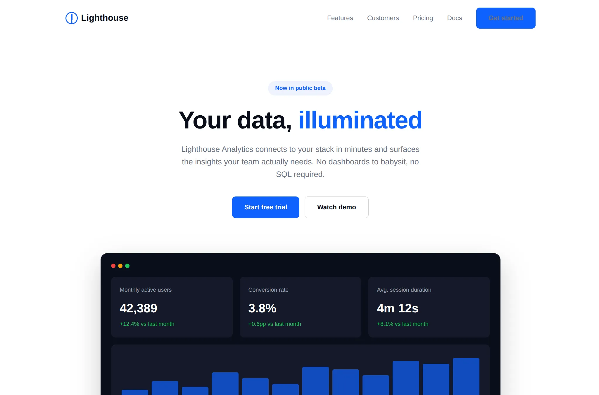
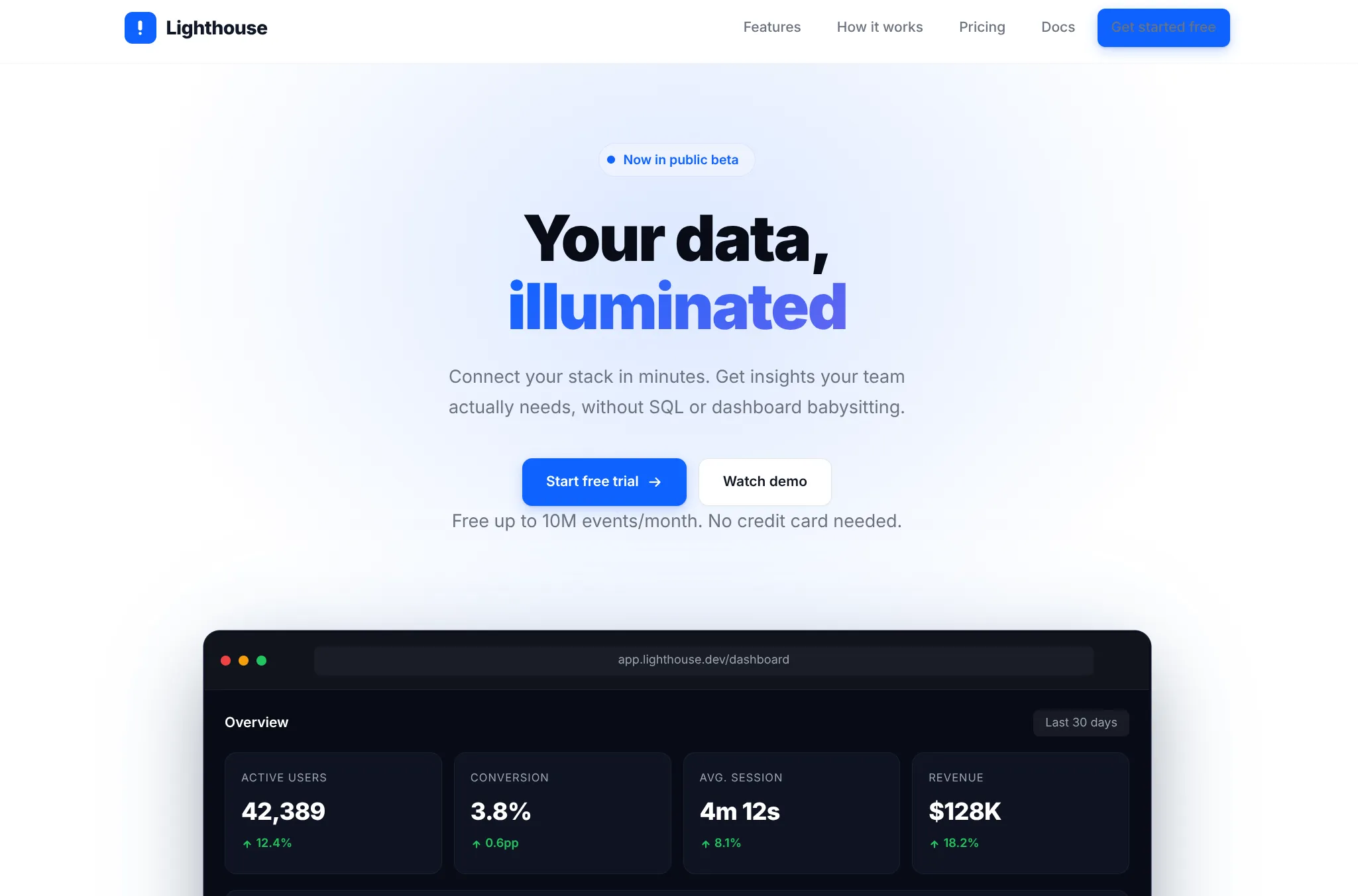
這是一個相當標準的現成 AI 網站:通用的風格、極少的內容和過度使用的版面配置。當然,還有偶爾出現的無法閱讀的按鈕。
我只給了它極少量的指示。這看起來可能不太公平,但我認為這是一個好的測試。顯然,如果你不斷給予指示,可以逐步把它變成一個很棒的網站。但那樣的話,所有設計工作都是你在做,模型只是在寫程式。大多數人不知道怎麼做。真正的突破在於 AI 能夠在人類不指定每個細節的情況下自行設計。
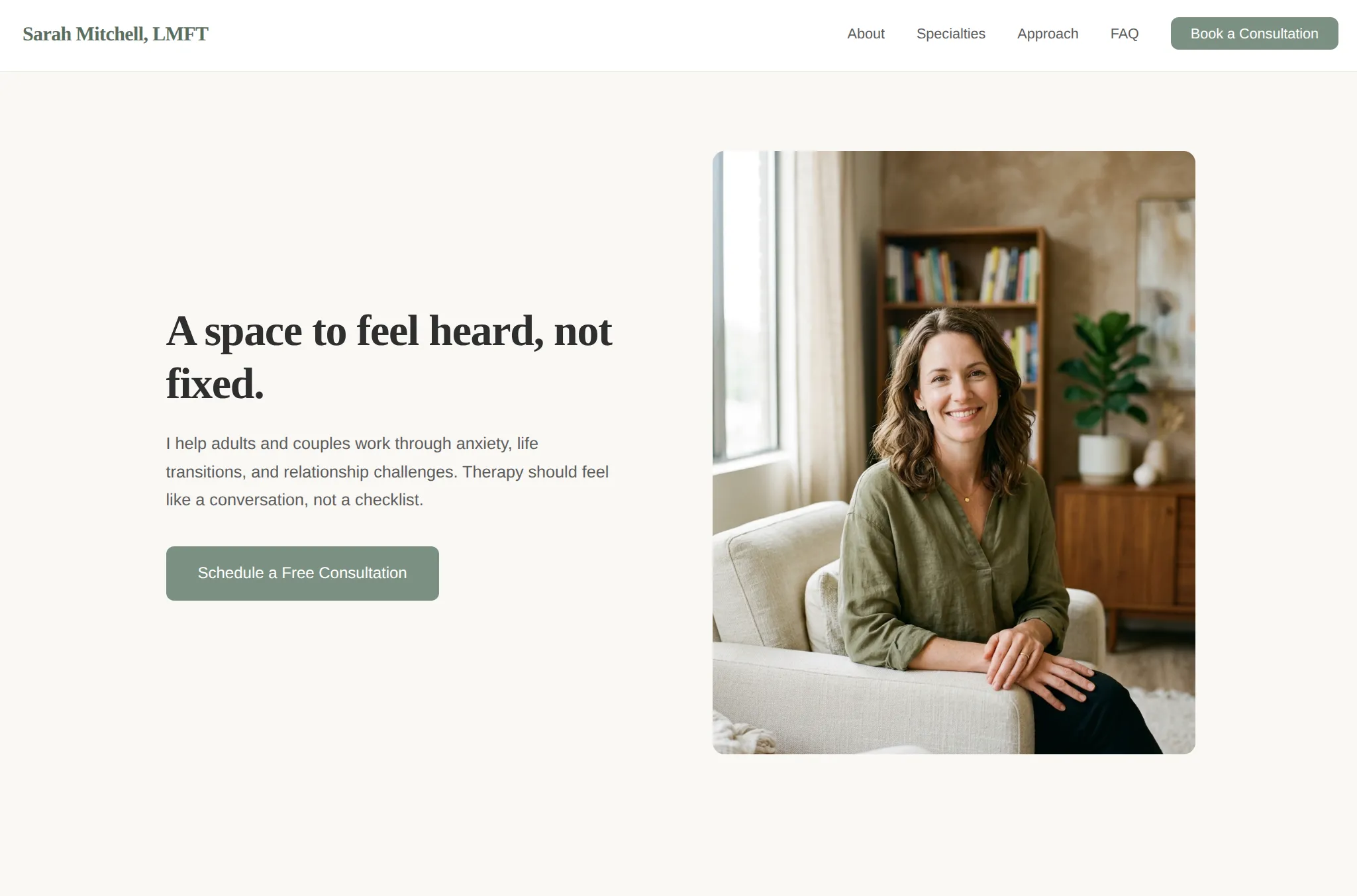
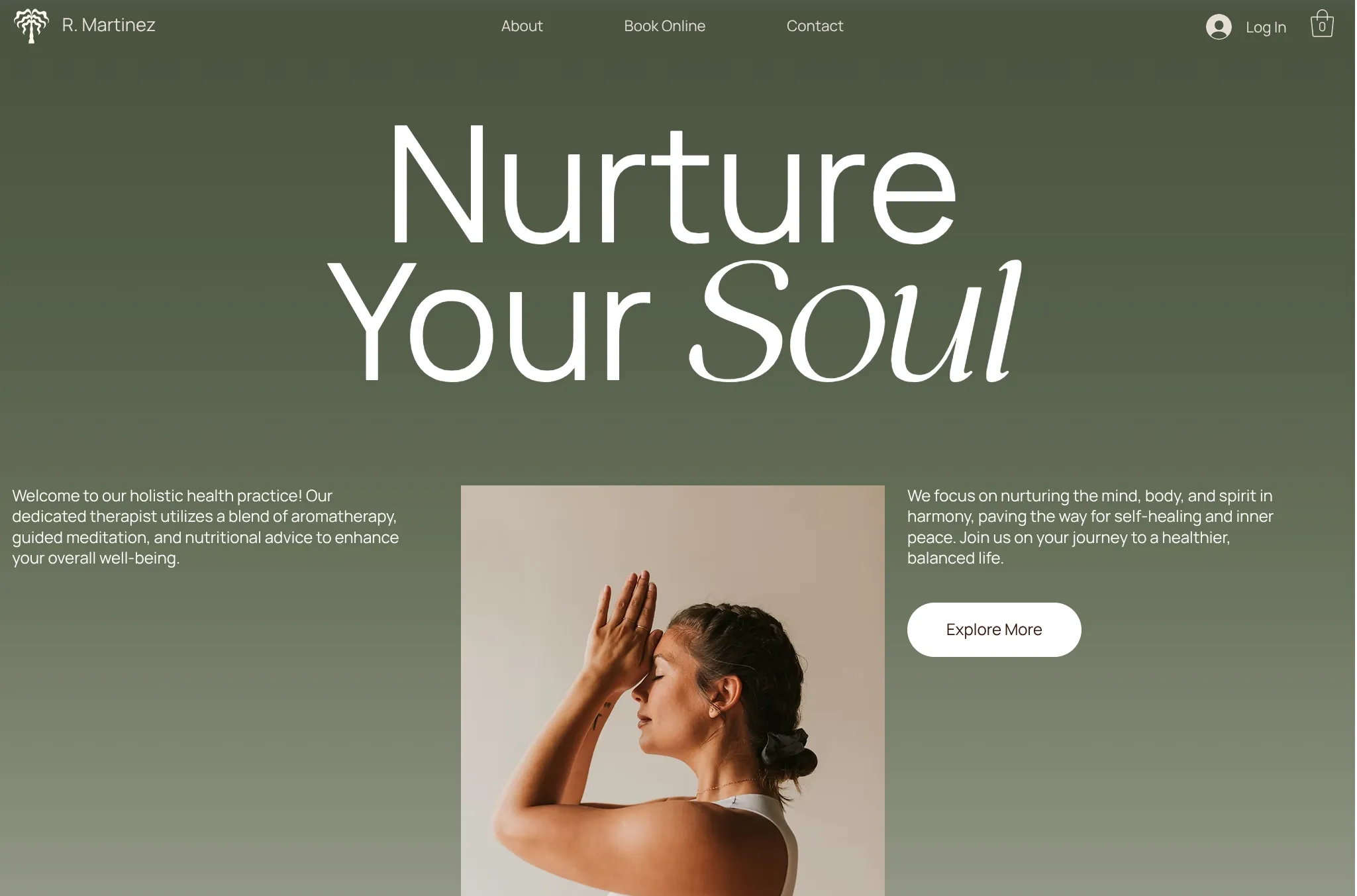
AI 的預設風格基本上是一個普遍性的問題。這裡展示的是一個心理治療師的網站。你可能會以為治療師網站看起來會截然不同。但事實並非如此,它只是做了一個差不多的網站,換成綠色按鈕而已。
如何改善 AI 網站?
設計系統
一個明顯的第一步:預先建好顏色、字型、圓角和陰影。當你只看程式碼時,這些決策很難做對。讓 AI 從一組好的設定開始,意味著出錯的方式更少。
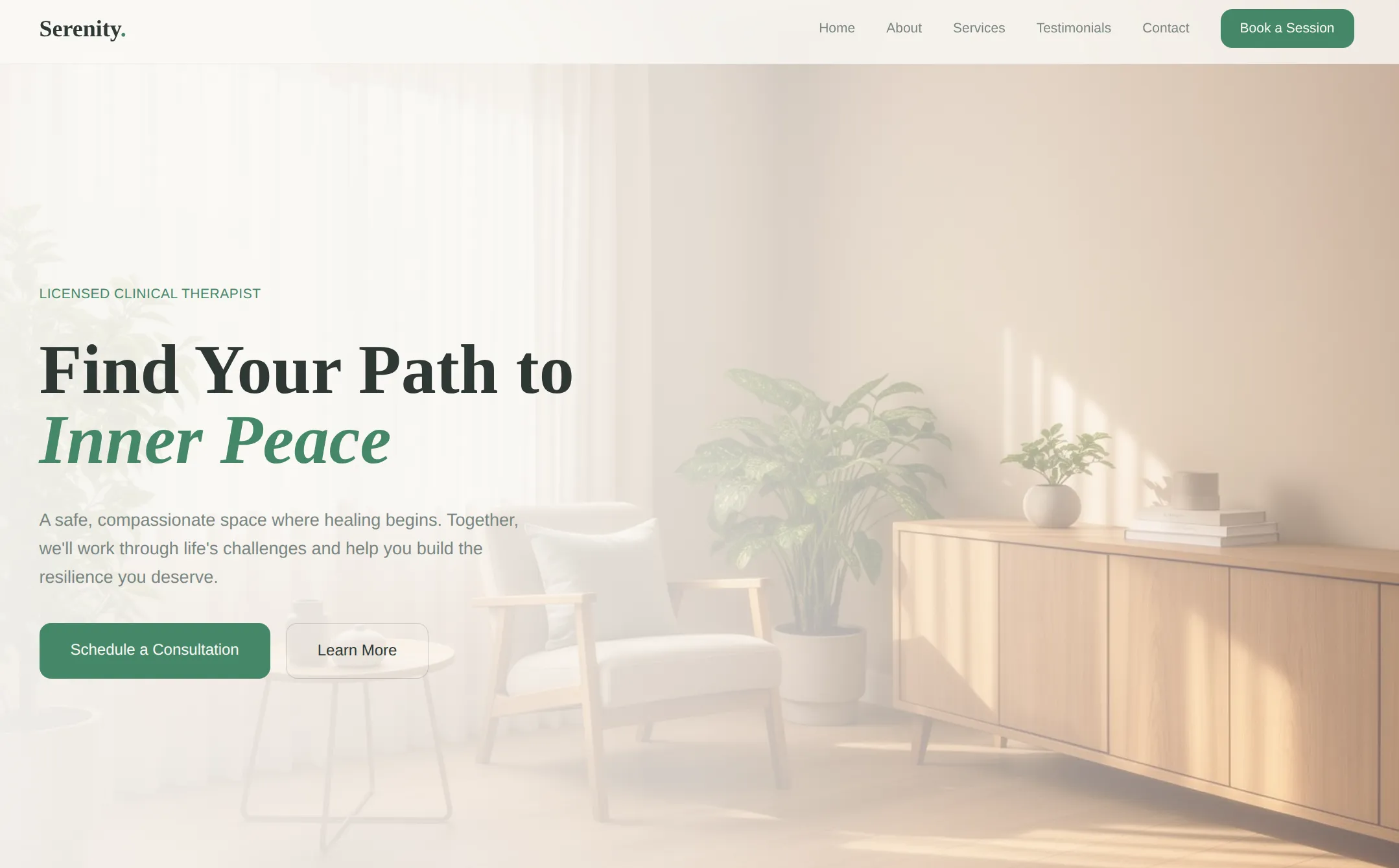
它有一點幫助。嚴重的顏色錯誤減少了。而且這裡使用了圖片背景。但整體而言,版面配置、內容密度和整體結構基本上是一樣的。設計系統給了模型一個調色盤,但沒有教它如何構圖。
指導
另一種方法:給模型一大套關於如何設計的指示。促使它做一些它通常不會做的事情。Claude AI 的主要聊天機器人有一個正好做這件事的技能:
This skill guides creation of distinctive, production-grade frontend interfaces that avoid generic "AI slop" aesthetics. Implement real working code with exceptional attention to aesthetic details and creative choices.
The user provides frontend requirements: a component, page, application, or interface to build. They may include context about the purpose, audience, or technical constraints.
Design Thinking
Before coding, understand the context and commit to a BOLD aesthetic direction:

Purpose: What problem does this interface solve? Who uses it?
Tone: Pick an extreme: brutally minimal, maximalist chaos, retro-futuristic, organic/natural, luxury/refined, playful/toy-like, editorial/magazine, brutalist/raw, art deco/geometric, soft/pastel, industrial/utilitarian, etc. There are so many flavors to choose from. Use these for inspiration but design one that is true to the aesthetic direction.
Constraints: Technical requirements (framework, performance, accessibility).
Differentiation: What makes this UNFORGETTABLE? What's the one thing someone will remember?

CRITICAL: Choose a clear conceptual direction and execute it with precision. Bold maximalism and refined minimalism both work - the key is intentionality, not intensity.
Then implement working code (HTML/CSS/JS, React, Vue, etc.) that is:

Production-grade and functional
Visually striking and memorable
Cohesive with a clear aesthetic point-of-view
Meticulously refined in every detail

Frontend Aesthetics Guidelines
Focus on:

Typography: Choose fonts that are beautiful, unique, and interesting. Avoid generic fonts like Arial and Inter; opt instead for distinctive choices that elevate the frontend's aesthetics; unexpected, characterful font choices. Pair a distinctive display font with a refined body font.
Color & Theme: Commit to a cohesive aesthetic. Use CSS variables for consistency. Dominant colors with sharp accents outperform timid, evenly-distributed palettes.
Motion: Use animations for effects and micro-interactions. Prioritize CSS-only solutions for HTML. Use Motion library for React when available. Focus on high-impact moments: one well-orchestrated page load with staggered reveals (animation-delay) creates more delight than scattered micro-interactions. Use scroll-triggering and hover states that surprise.
Spatial Composition: Unexpected layouts. Asymmetry. Overlap. Diagonal flow. Grid-breaking elements. Generous negative space OR controlled density.
Backgrounds & Visual Details: Create atmosphere and depth rather than defaulting to solid colors. Add contextual effects and textures that match the overall aesthetic. Apply creative forms like gradient meshes, noise textures, geometric patterns, layered transparencies, dramatic shadows, decorative borders, custom cursors, and grain overlays.

NEVER use generic AI-generated aesthetics like overused font families (Inter, Roboto, Arial, system fonts), cliched color schemes (particularly purple gradients on white backgrounds), predictable layouts and component patterns, and cookie-cutter design that lacks context-specific character.
Interpret creatively and make unexpected choices that feel genuinely designed for the context. No design should be the same. Vary between light and dark themes, different fonts, different aesthetics. NEVER converge on common choices (Space Grotesk, for example) across generations.
IMPORTANT: Match implementation complexity to the aesthetic vision. Maximalist designs need elaborate code with extensive animations and effects. Minimalist or refined designs need restraint, precision, and careful attention to spacing, typography, and subtle details. Elegance comes from executing the vision well.
Remember: Claude is capable of extraordinary creative work. Don't hold back, show what can truly be created when thinking outside the box and committing fully to a distinctive vision.
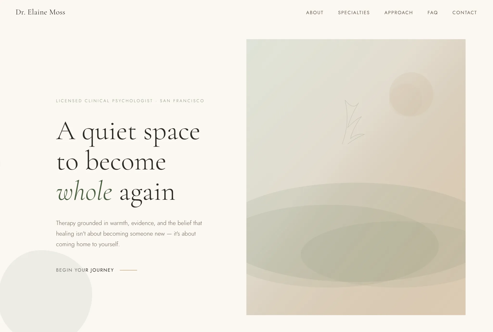
這是真正的改善。整體版面配置與之前類似。但它終於看起來像一個真正的治療師網站了,有更柔和的字型和獨特的按鈕風格。如果你換上自己的圖片,完全可以直接發布。
在我們的測試中,我們發現自訂指示並不能解決重複性問題。模型仍然使用相同的模式,所以它基本上還是看起來像標準的 AI 網站,只是更漂亮的版本。
此外,避免過度使用的模式比 Claude 的 prompt 所暗示的更困難。他們說:
NEVER use generic AI-generated aesthetics like overused font families (Inter, Roboto, Arial, system fonts)
所以,模型轉而過度使用其他字型,如 Jost 和 Cormorant Garamond。而且現在它無法處理 Inter 確實是正確選擇的情況。基本上,你可以強制消除它的壞習慣,但無論如何,它都會重複做同樣的事情。
參考圖片
如果你完全跳過文字,直接把你想要的東西展示給模型看呢?把你喜歡的設計截圖給它,請它做出類似的東西。
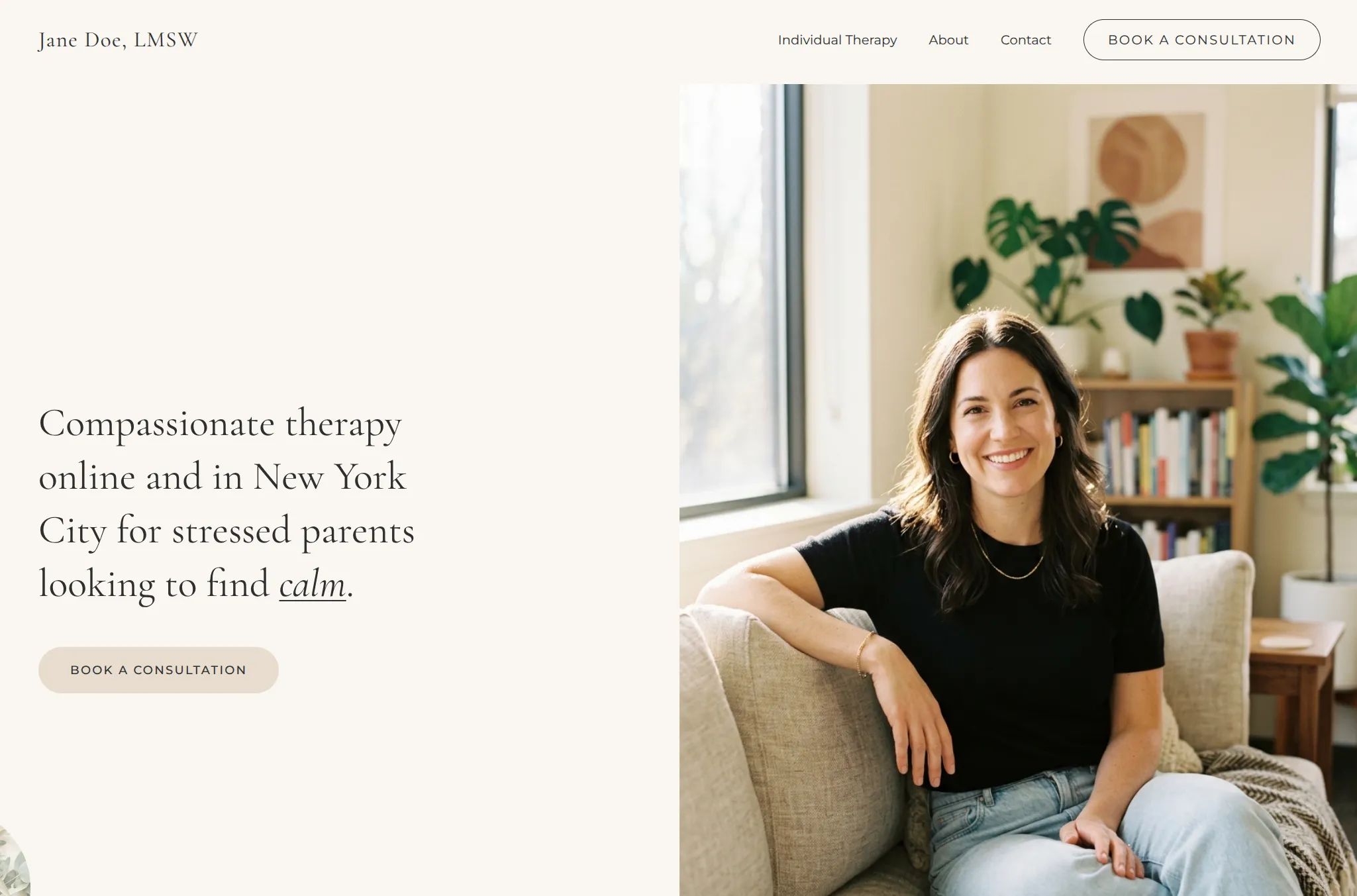
這是第一個讓模型跳出它總是使用的那 2-3 種版面配置,創造新版面的策略。它從來不會自己做半螢幕圖片。
圖片是一種超高效的資訊分享方式。模型能同時捕捉到版面配置、間距、色彩關係和密度,這些都是你在 prompt 中永遠不會想到要描述的。但這很脆弱。它無法重現複雜的版面配置或動畫。而且如果模型需要在參考之外填充更多內容,它就會回到預設風格。
程式碼和風格模板
這或許是最暴力的方法。直接給它程式碼。這就是 ChatGPT 目前在做的事情。它在建立網站時使用模板庫。
當你這樣做時,品質顯然會大幅提升。你只是在給 AI 答案。但大多數人並沒有現成的程式碼來做他們想要的東西。所以這主要是平台建設者的策略,為其他人製作工具。
不過有一個問題:
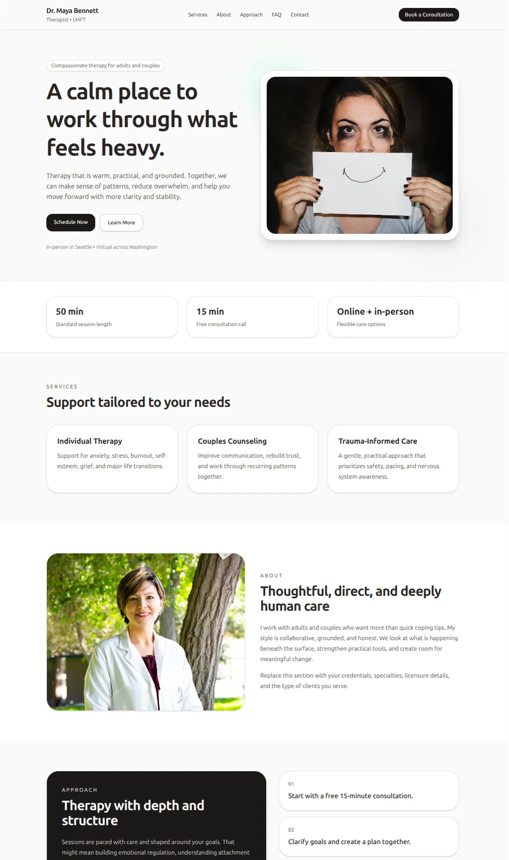
"Make a therapist website"
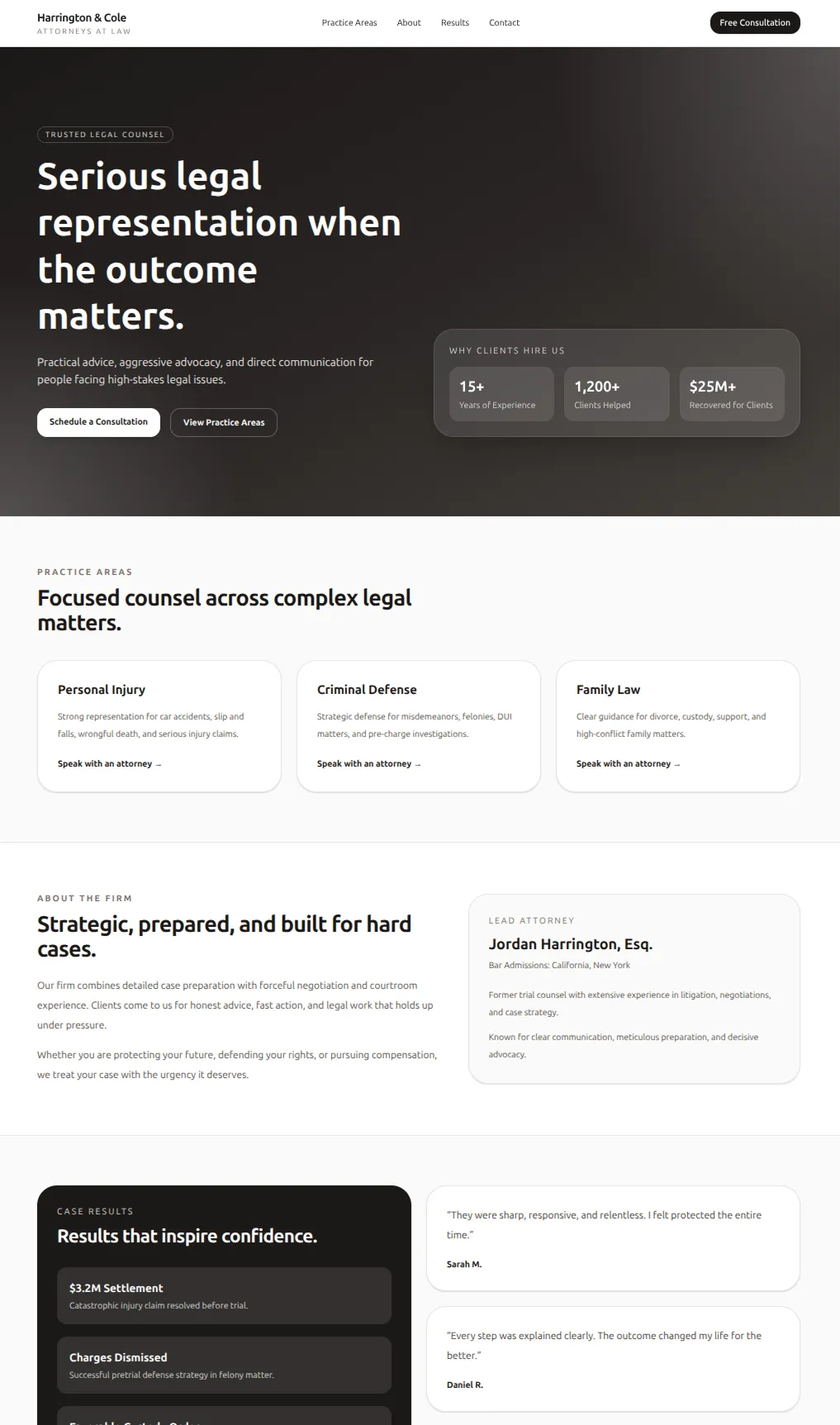
"Make a lawyer website"
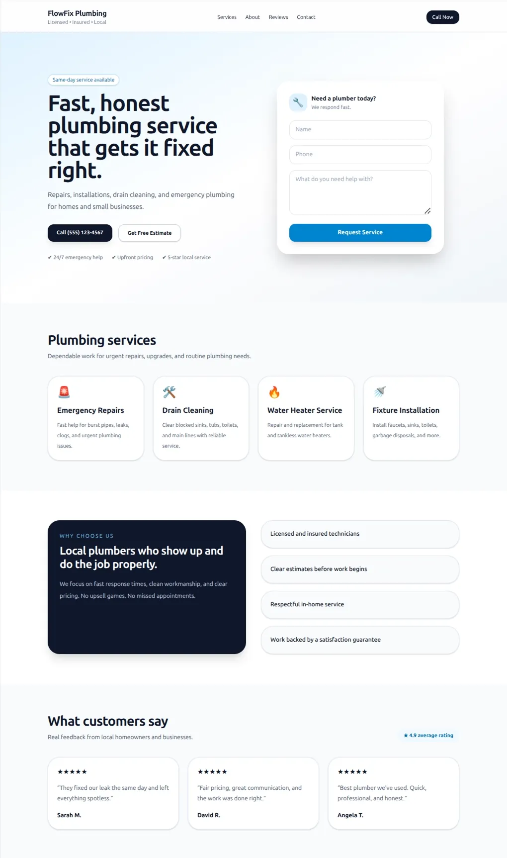
"Make a plumber website"
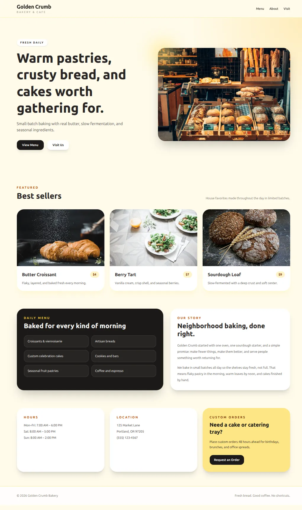
"Make a bakery website"
如果你給 AI 範例,它會產出看起來非常相似的網站,只做最少的調整來配合情境。所以當 ChatGPT 目前建立網站時,不管 prompt 是什麼,它看起來都像同一個科技新創公司。
不幸的是,即使有了所有這些策略,我不確定我們做出了比通用 Wix 模板更好的東西。
自我迭代
為什麼不讓模型看看自己的輸出並加以改進?畢竟 Wix 設計師可以進行很多次迭代。
理論上這可以解決一切。實際上它運行了 20 分鐘,花了 10 美元的 token,然後很快就停滯了。例如,我讓它對之前的 lighthouse 網站進行迭代。它甚至沒有注意到那個無法閱讀的按鈕。
自我迭代可能是未來的方向。但今天的模型還沒完全準備好。
在探索了所有這些方法之後,我們有了一些改善風格的真正選項。除此之外,我們覺得自己對 AI 模型的運作方式有了更深層的理解。
我們對 AI 模型學到了什麼
模型真的偏好預設風格
模型中內建了一種預設美學。它就像訓練資料中的平均網站。每次做決策時,除非有明確的理由不這樣做,否則它就使用預設風格。這就是為什麼 AI 網站如此容易辨認,也是為什麼自我迭代實際上不會帶你走到任何地方。模型並不是收斂向獨特的設計,而是收斂向預設值。如果你想讓 AI 打破這種模式,你需要給它一些東西把它從預設值中拉出來,比如參考圖片或程式碼範例。
圖片比文字有更高的頻寬
用文字引導模型很困難。你可以寫一整段描述想要「乾淨、現代、大量留白」的東西,但這幾乎毫無用處。你最終總是得到預設風格。圖片能讓模型創造獨特的設計,因為它們承載了更多資訊。一張截圖編碼了數百個關於間距、顏色和版面配置的微決策,這些是你用文字無法定義的。所以除非你有程式碼範例,參考圖片是引導 AI 的最佳方式。
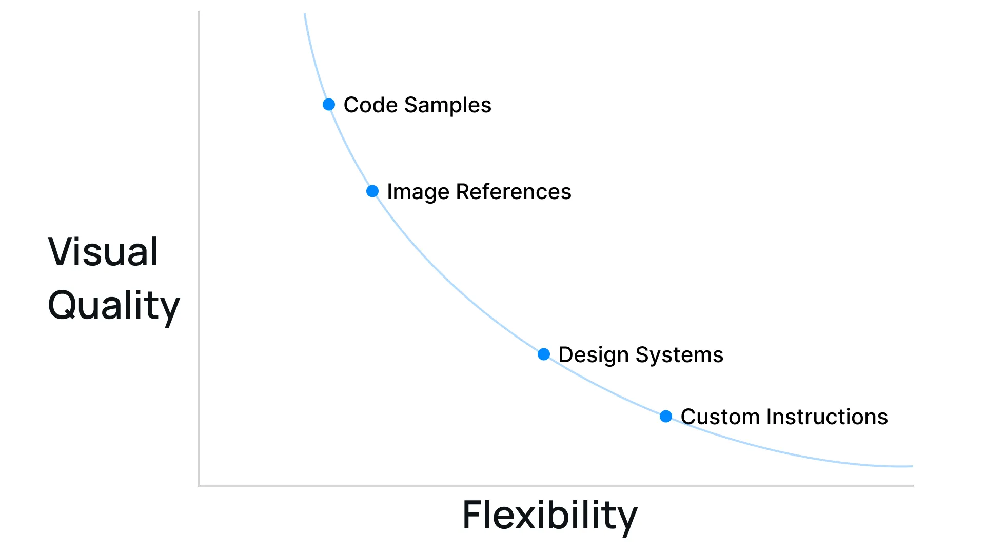
預先建構是一條取捨曲線
我們嘗試的每一種策略都是為 AI 預先做決策的一種形式。當你給它更多的東西,你可以提高品質上限,但它會失去靈活性。不過,為每一個潛在用例做準備只對像 Repaint 這樣的通用平台才重要。如果只是為你自己使用,你可以(也應該)給 AI 具體的參考來最大化視覺品質。
如何用 AI 做出更好的設計
避免千篇一律的最簡單方法是給 AI 獨特的視覺參考,例如你喜歡的網站圖片、程式碼範例,或兩者兼具。一旦你確定了風格,AI 應該能夠生成更多匹配的區塊。這比大多數人所做的那樣不斷給予指示要有效得多。
或者,如果尋找參考和建立風格讓你覺得有壓力,你可以試試 Repaint。我們建立了一個大型的風格庫,包含程式碼範例和設計變數。AI 不會被迫使用單一風格,因為我們有很多選項。
更廣泛地說,在任何視覺 AI 工具中,無論是應用程式設計、圖片生成還是影片生成,與其說「讓它看起來更高級」,不如試著給它更多截圖和範例。這會有效得多。